Beautycounter
Beauty & Skincare eCommerce App
2017

Manage your Beautycounter business on the go
Safety forward, LA-based direct retail skin care and cosmetics brand Beautycounter has over 40, 000 independent consultants who run their own businesses buying and selling a catalogue of over 150 cosmetics products to consumers nationwide.
As the Lead Engineer of my team at Prolific Interactive, I was tasked with building an iOS application that empowered Beautycounter’s consultants to manage their business, increase their sales and enroll new consultants from their phone. I worked with 4-5 Backend Engineers from Slalom Consulting to architect a mobile-focused Middleware service that combined Customer and Product data from several backend platforms.
Along with my team (2 Designers, 1 Product Manager and 1 Junior iOS Engineer) we designed, tested and built out a beautiful, human-centered product that is now used by consultants nationwide. I was responsible for architecting the iOS application, implementing major product features, designing the backend REST API, implementing a continuous integration pipeline, and delivering weekly builds to the client.
I built a Product Catalog, Shopping Cart, Checkout flow, Consultant Enrollment flow, and various Contact Management Tools. I worked closely with my design team to evolve the design into a beautiful, fast and easy user experience that overcame a series of performance limitations with the backend to continue to deliver a delightful, human-centered experience for our users.
App Architecture
Our application was entirely written in Swift 3.0, used an MVVM (Model, View, ViewModel) architecture and used a series of embedded frameworks to modularize the business logic, UI code and generic ecommerce classes into seperate targets. This app became the foundation for an internal white-label ecommerce framework called PCFSwift (Prolific Commerce Framework - Swift), which went on to be used to share similar logic across several commerce applications for clients.
We designed and developed a dynamic interface theme framework which allowed for Text Styles to be easily configurable by designers without having to write any code. We wrote BDD (Behavioral Driven Development) unit tests, and developed several re-usable inline progress components to ensure the User Interface felt fast and responsive despite performance limitations on the server.
Features
Commerce (Catalog, Bag, Checkout)
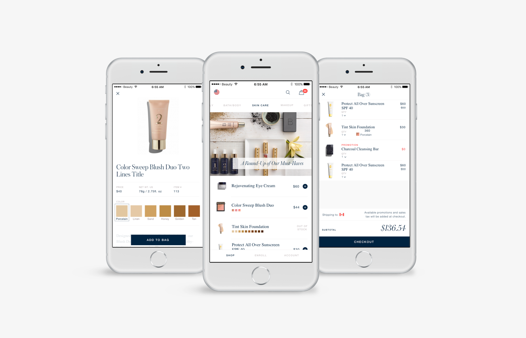
First and foremost the Beatycounter iOS app was a commerce application which enabled users to browse a catalog of beauty products, add them to a shopping cart and checkout their purchases. Early on it became clear that the core parts of this experience were not unique and I implemented these features as a separate, generic framework called Prolific Commerce Framework (PCF) which would allow us to internally re-use the framework to build a similar experience for a different brand.
It included out of the box Data Models, Data Stores, Networking and Controllers for common commerce concepts such as CDP (Catalog Detail Page), PDP (Product Detail Page), Shopping Cart, and Checkout. Using this framework I built a comprehensive commerce experience for Beautycounter, allowing users to navigate through a series or product categories (such as Skin Care, Bath and Body, Makeup and Gifts). Users could easily view details about each product, as well as switch between various color variations and add the products to a shopping cart.
One of the biggest challenges of building the commerce features of this app was dealing with Beautycounter’s unique and complex product variations system. For Beautycounter customers, each Product item included several different SKUs which represented color or style variations of the same item. The data for these SKUs came from multiple different backend systems, and parts of the business, which meant performing a lot of cleansing of the data in order to integrate them together and provide users with a seamless, unified way of viewing products.
Seemingly simple screens such as the PDP (Product Detail Page), involved combining multiple asynchronous operations together to process SKUs for an item, and displaying them in a flat list of colors or images.
Asynchronous Loading States
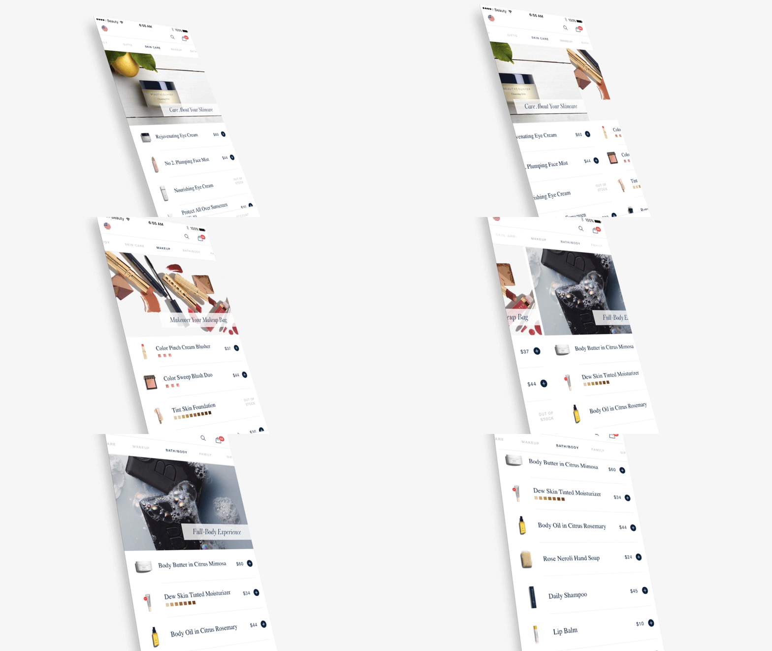
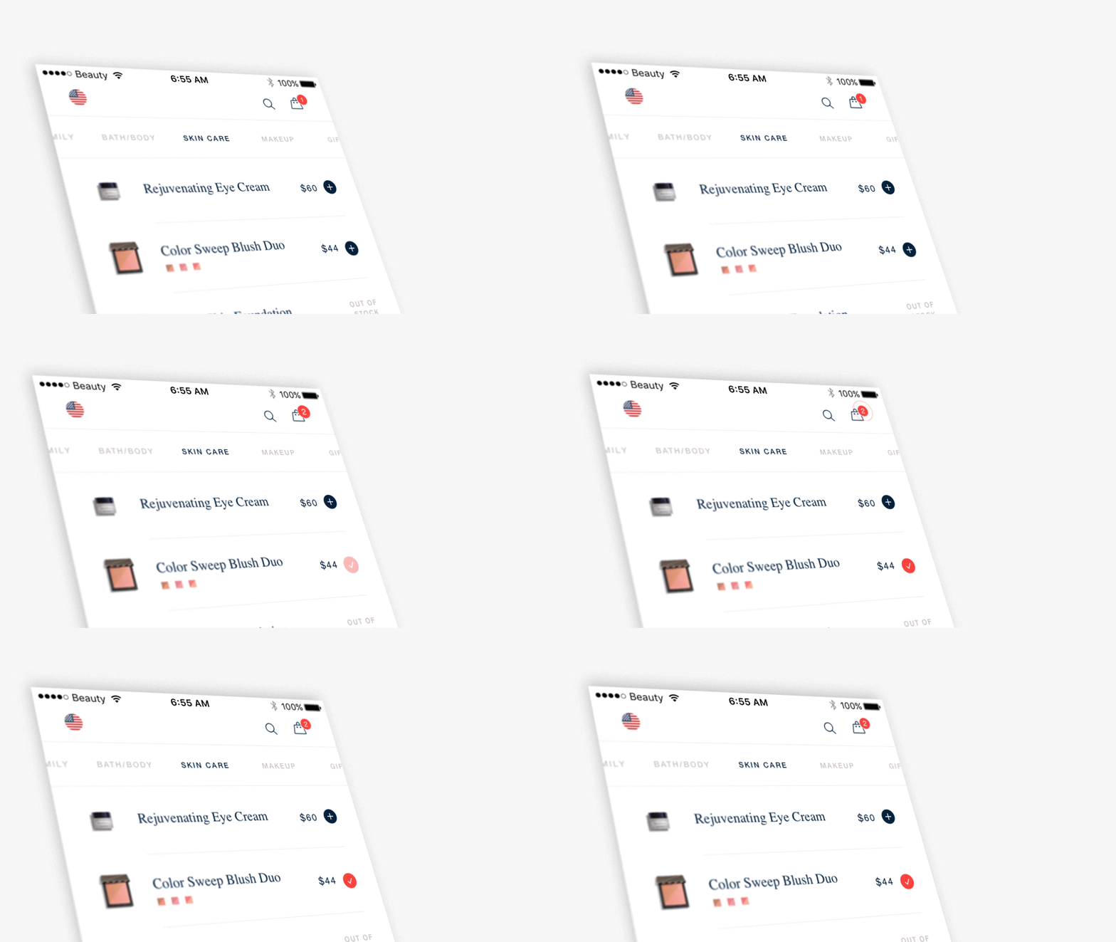
Initially when I implemented the ‘Add to Bag’ feature, the loading state blocked the UI and forced the user to wait until an item was successfully added before continuing to browse the catalog. Performance issues on the backend made this experience slow and difficult for users. Browsing around the catalog and adding products meant that users were waiting 5-10 seconds for each product to successfully be added before being able to continue.
I worked alongside the design team to implement an inline loading indicator for each Product Cell which meant that products could be added to the bag asynchronously in the background, and the user could continue to browse around and add other products to the bag instead of waiting for each netork request to complete. It was important to consider Cell Reuse in this case, so that if a network request for a specific Product returned, and the corresponding Product Cell was now being re-used to display a different product, the UI remained correct.
Checkout
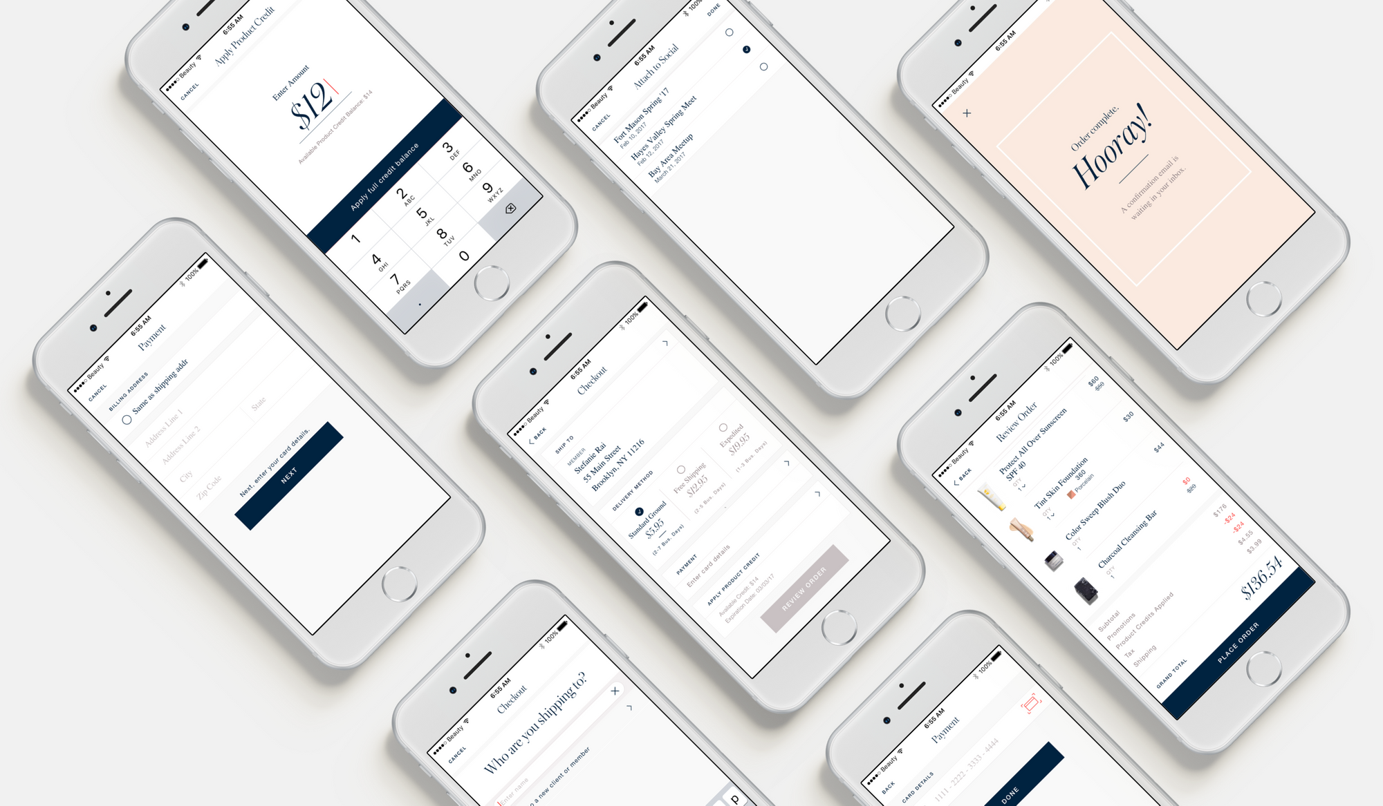
Once ready, users could checkout by adding a Shipping Address, Delivery Method, Payment Information and could apply Promo Codes to their purchase. Although it looks simple, the Checkout Overview screen involved displaying data from multiple different API endpoints, which required coalescing asynchronous network requests together to update specific sections of a UICollectionView upon completion. Each section had to display its own placeholder views while performing independent network requests that would update the corresponding section without causing any race conditions or reloading the entire UICollectionView.
I integrated with Authorize.net, to enable users to pay for their products using their Credit Card, or Debit Card. This involved exchanging tokens, and storing encrypting sensitive user data at storing it in the Keychain securely.
Client Management
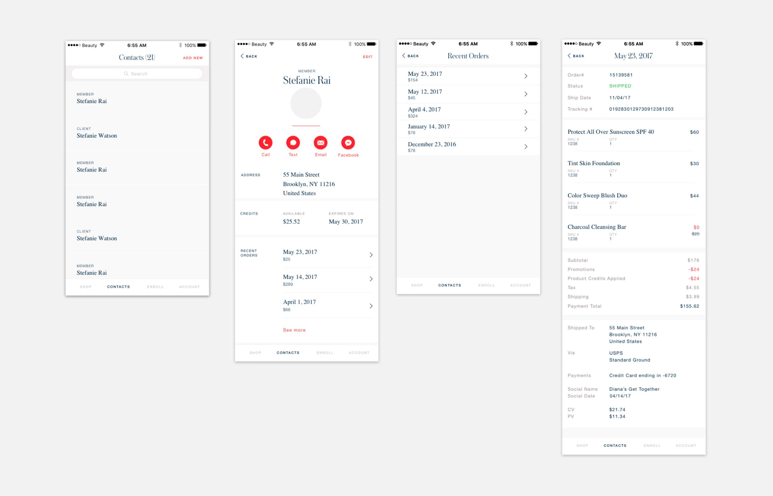
Consultants using the app also needed to be able to manage their list of clients and view insights into the sales they’ve made. I built a ‘Contacts’ tab within the app which provided a series of tools for users to view a list of contacts, contact information, deep links to Call, Message or Email a client and recent orders associated with each client.
Due to the architecture and design decisions made early on in this project, implementing the Contacts tab was a fast and easy process. It became the most compelling feature for Beautycounter in encouraging consultants to manage their business from their phone. This feature was iterated on and improved, and went on to provide deep insights into consultant’s profits, OKRs and metrics related to their business.
Designer & Developer Collaboration
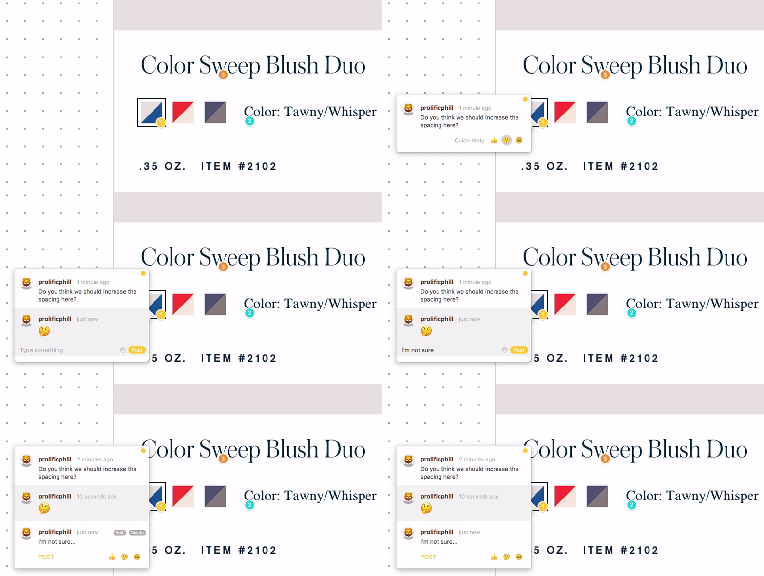
As the Lead iOS Engineer on this project, one of my most defining achievements was encouraging a strong collaboration between Design and Engineering. I wrote a blog post for Prolific that outlines the tools and processes that I used to facilitate this strong relationship, including the use of a collaboration tool called Zeplin.
By working closely with the design team to increase direct communication early on in the design and development lifecycle, encouraging frequent design reviews and showcasing Work In Progress features - I reduced the friction of typical back and forth between Designers and Engineers. Instead of being two seperate steps within a linear process, we unified into a singular team that worked side by side to ensure that the needs of both parties were being met to a high standard at all times. We achieved an amazing level of productivity that reflected in the high quality work in which we produced on this product.
Theme Framework
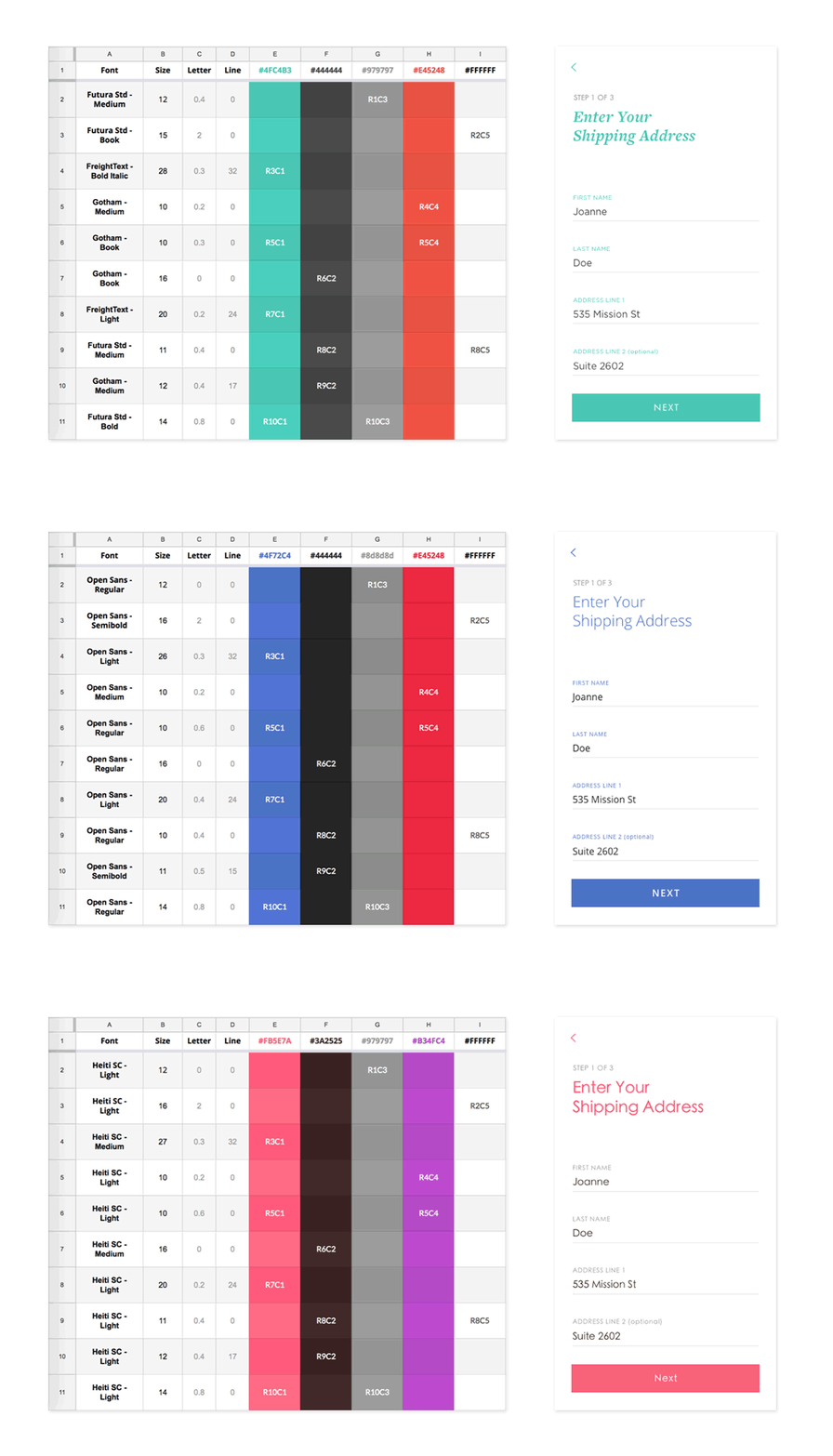
A common need that Designers had while working on this application was to be able to easily change the style of text throughout the app (such as font, color and kerning). I worked closely with a designer to construct a framework that enabled designers to define a series of Text Style paradigms that could be easily swapped out without the need to write any code. Nicknamed “The Ying Grid” after the designer Ying, the system was based upon a grid of Columns and Rows.
Each Column represented a specific Color Style, and each Row a specific set of Text Attributes (Font, Weight, Kerning, Size, Line Height…etc). This Grid which could be codified into a shared Google Spreadsheet, was then implemented in Swift using a series of Protocols (TextStyleRow, TextStyleColumn). During regular ongoing development, Engineers would refer to generic Text Styles using a specific Row/Column combination, agnostic of the underlying values. For example, a UILabel would be configured as “R2C4”, or “R7C6”.
Whenever the Design team needed to adjust a specific Font, or Color in the app, they simply updated the underlying values in the spreadsheet and these values were reflected back into the app.
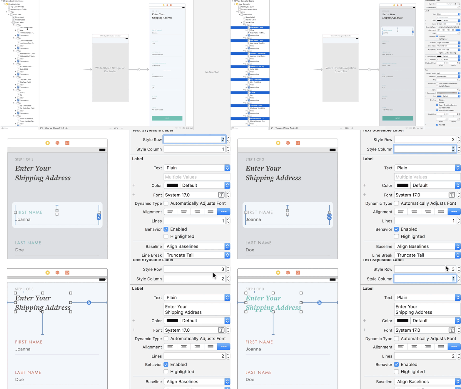
Taking this even further, I defined extensions on common UIKit controls such as UILabel, UIButton, UITextField and UITextView which provided IBDesignable configurability of these Row Column values. A UILabel could be added to a UIStoryboard interface, and the Engineer (or Designer) could update the Row/Column for the label natively within Inteface Builder. Due to the power of IBDesignable, the label would visually update in real time to its new color, of font without the need to write any code.
What did I learn?
As the Lead iOS Engineer, I learned a lot about responsibility and ownership over an end-to-end solution, as well as how to design and architect a solid foundation for the long term future of a codebase. Using all of my experiences on previous teams, I encouraged strong best practices in writing code and collaborating amongst the Engineering team. I enforced a TDD (Test Driven Development) approach to writing code that resulted in high code coverage for this project. I also learned about working alongside external vendors to design and develop RESTful APIs based on the needs of a mobile app, and how to work around performance limitations and complicated backend systems to ensure that the User Experience is positive for users.
Most importantly, I learned about the importance of working as closely as possible with the Design team when building a product. Communicating clearly and directly with designers, as early on in their workflow and the engineering workflow is invaluable. Having regular and consistent show-and-tells from both sides of the work that’s currently in progress, enables both teams to adjust to change quickly and easily. I learned that I have a strong passion as an Engineer for closing the gap between Designers and Developers.
Forming a strong bond with the Design team as an Engineering team creates a level of productivity and quality for a product that cannot be matched any other way.